Metal Toad Brand Refresh
Branding, UX, + Design
In November 2015, Metal Toad participated in work sessions with Emotive Brand — an Oakland-based brand consultancy — to truly understand what Metal Toad offers and why we are uniquely valuable. These work sessions resulted in a refined positioning statement, promise, and tagline.
In February 2016, the Design and UX team undertook an extensive competitive analysis and brand positioning exercise to determine where we are — and where we are going — in the vast expanses of today’s software landscape. We leveraged our core values, our work with Emotive, empirical data, market research, and individual Toad input.
Metal Toad Logo Before & After
The Metal Toad brandmark remained the same. The logotype, on the other hand, had been replaced. The previous slab serif logotype was difficult to read when scaled down to smaller sizes and its industrial feel was better suited for a younger, scrappier Metal Toad.
The new logotype, Gotham, was chosen because it is highly legible at small sizes, making it ideal for logotype. Gotham was inspired by an engineer’s idea of “basic lettering.” Tobias Frere-Jones, the typeface’s designer is quoted as saying, “It’s the kind of letter an engineer would make.” due to its geometry and mathematical proportions. This modern logotype is a nod to Metal Toad’s engineering focus and builds upon the core value of user experience.

Metal Toad's Color Palette
A secondary color palette was developed to expand upon the primary color palette. The secondary colors follow the characteristics of the brand’s primary orange. Bright and playful, there is an element of curiosity to them that ties in with Metal Toad's core values.
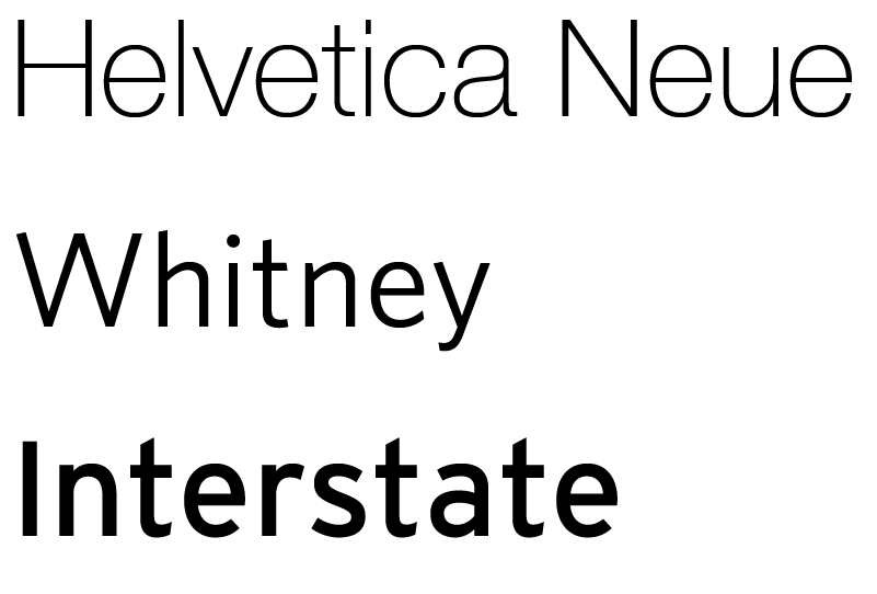
Typefaces
Metal Toad's previous typeface, Helvetica is difficult to read on screen and kept Metal Toad from embracing a brand all their own. Helvetica was replaced with two new typefaces — Whitney and Interstate.
Whitney, Metal Toad's new primary typeface has a more organic structure than Helvetica, making it feel more warm and welcoming.
Interstate and Whitney were intentionally chosen and paired together for Metal Toad to offer a complimentary and subtle sophistication that increases readability and enhances the user experience.
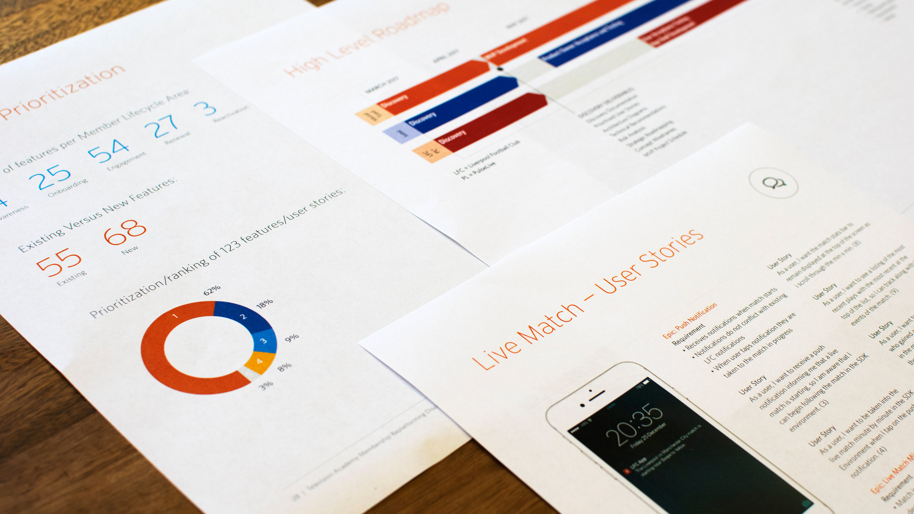
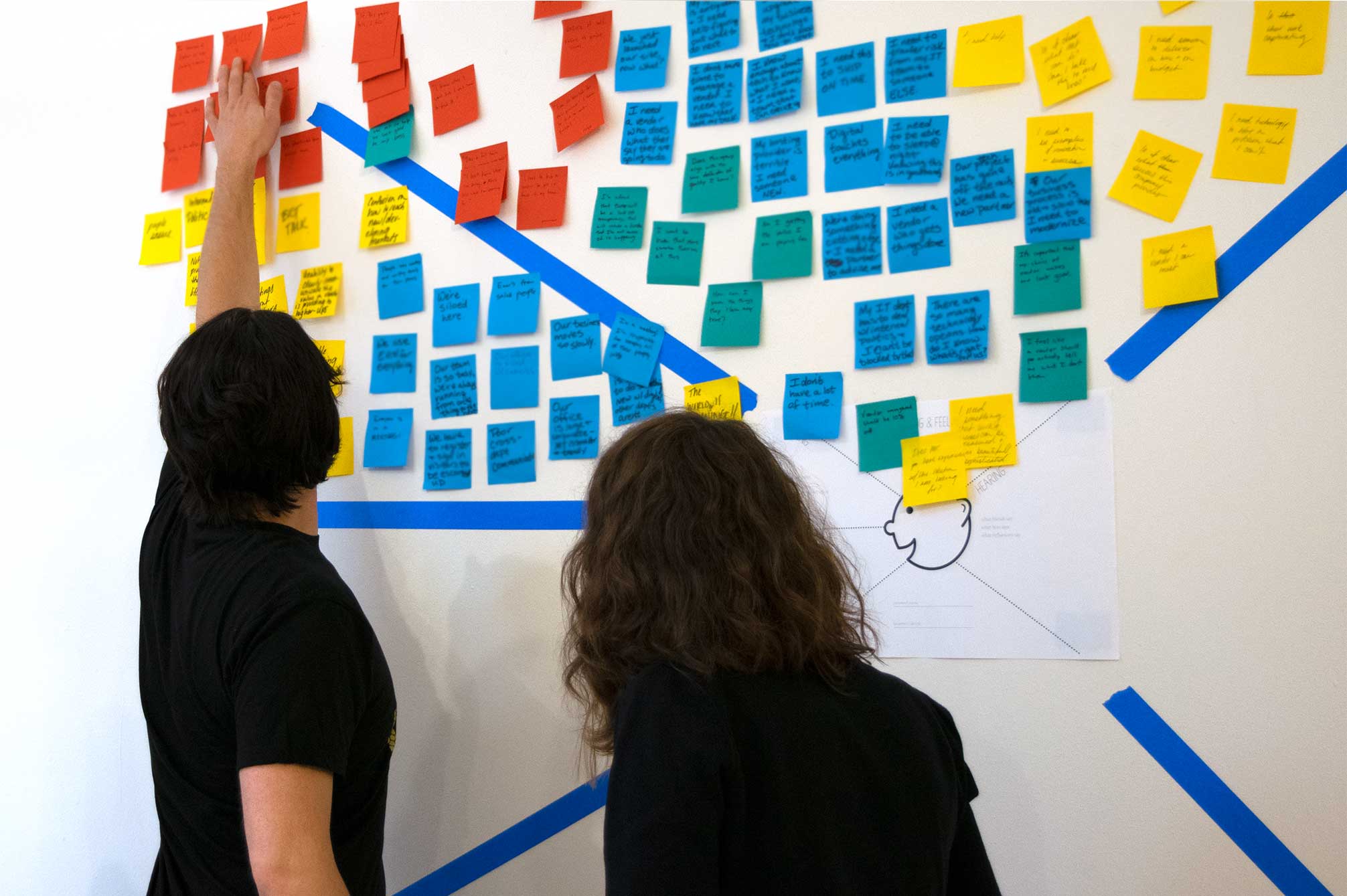
Buyer Persona Offsite
Following the Brand Refresh, the Design + UX team held an offsite to create Metal Toad's buyer personas based on research and interviews conducted with Metal Toad's clients, buyers, and stakeholders.
The Design + UX, Engineering, and Marketing teams gained multi-faceted, first-hand insights of who our buyers are, motivations, goals, pain points, why/how they buy, and what core offering(s) they buy. This knowledge helps Metal Toad prioritize who to design for, and determine what/how to design for them.
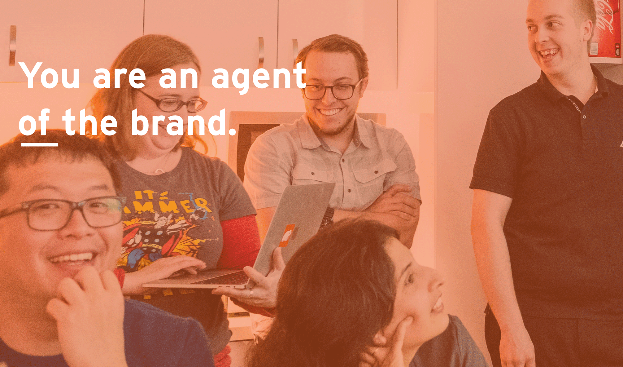
Metal Toad Brand Onboarding
Within a month of each Metal Toad new hire's start date they are "brand onboarded." Brand onboarding explains why Metal Toad's brand is important through discussion around what a brand is, what it is made of, and a quick examination of some of the world's leading brands and what makes them so successful.
Through the brand onboarding process new hires receive templates, tools, and a handly little guide to apply Metal Toad's brand to client deliverables and the language to successfully articulate Metal Toad's vision and mission within the technology and broader community.
Metal Toad has found this process to be successful in empowering Metal Toad employees to be an agent of their brand and to wear the brand proudly.