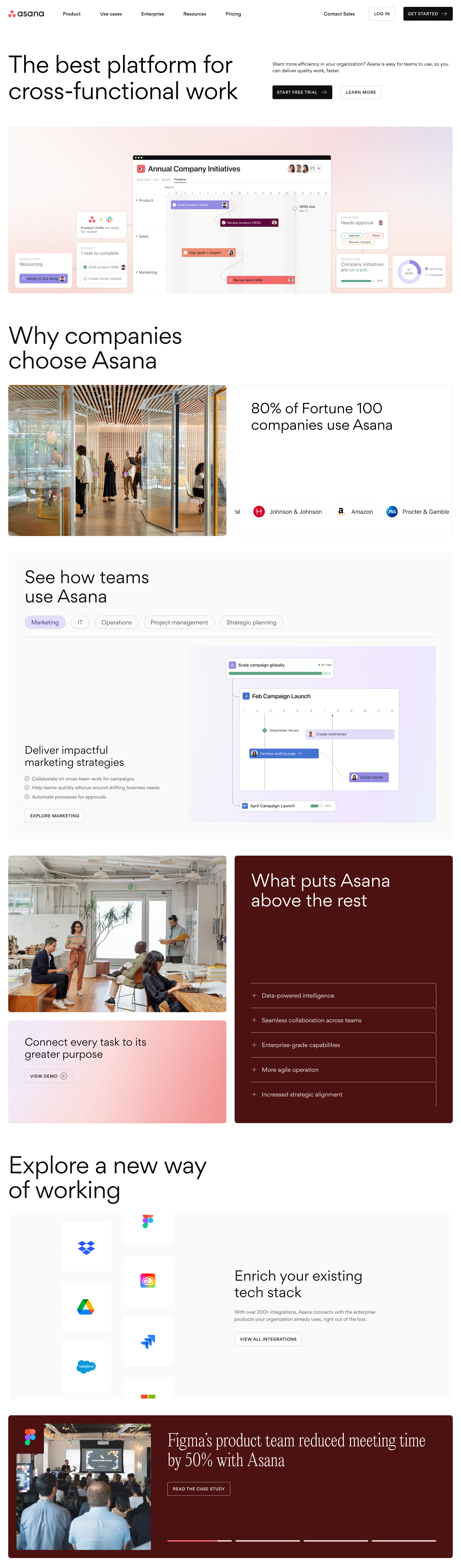
Asana Web Vision
We reimagined Asana's website experience to win upmarket — inspiring confidence and offering clarity among potential Enterprise customers. We developed a North Star design vision for the site that established a foundation for stunning visual design, future consistency, and scalability.
The result was a modular, product-forward design system that allows for flexibility between various forms of content as well as the ability to create dynamic and engaging layouts on each page.
Agency & Role: Instrument, Lead UX Strategist
Process & Methods: Stakeholder Interviews, Color Strategy, Wireframing + Prototyping
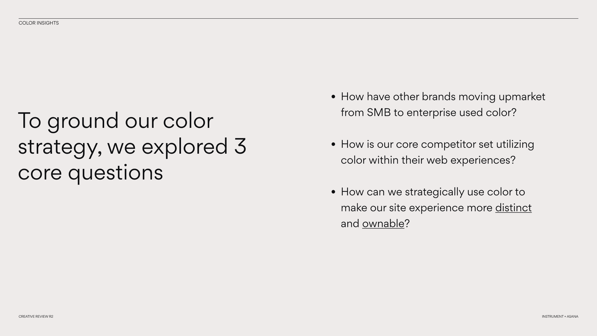
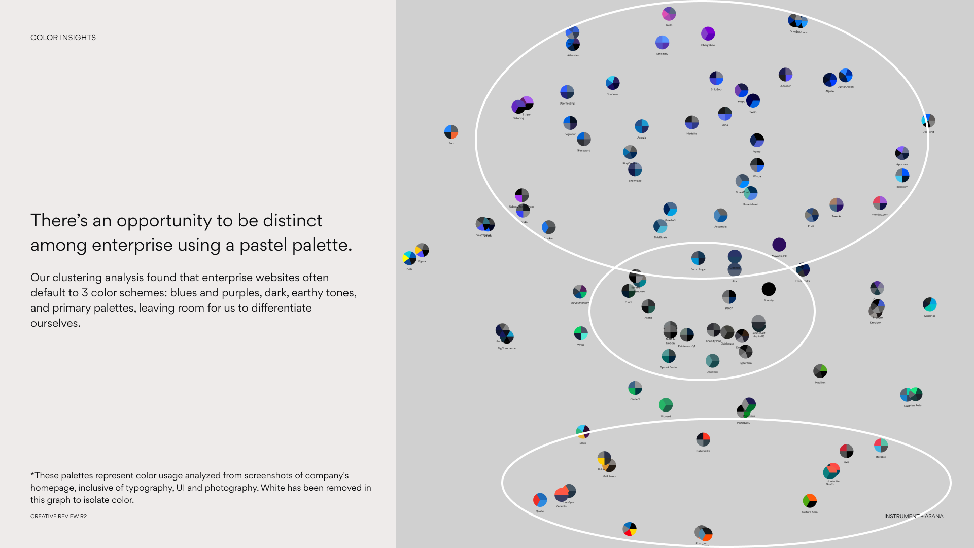
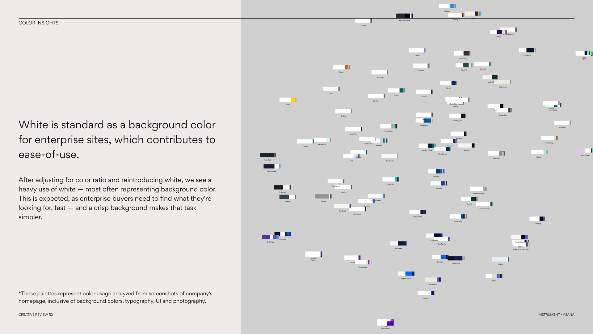
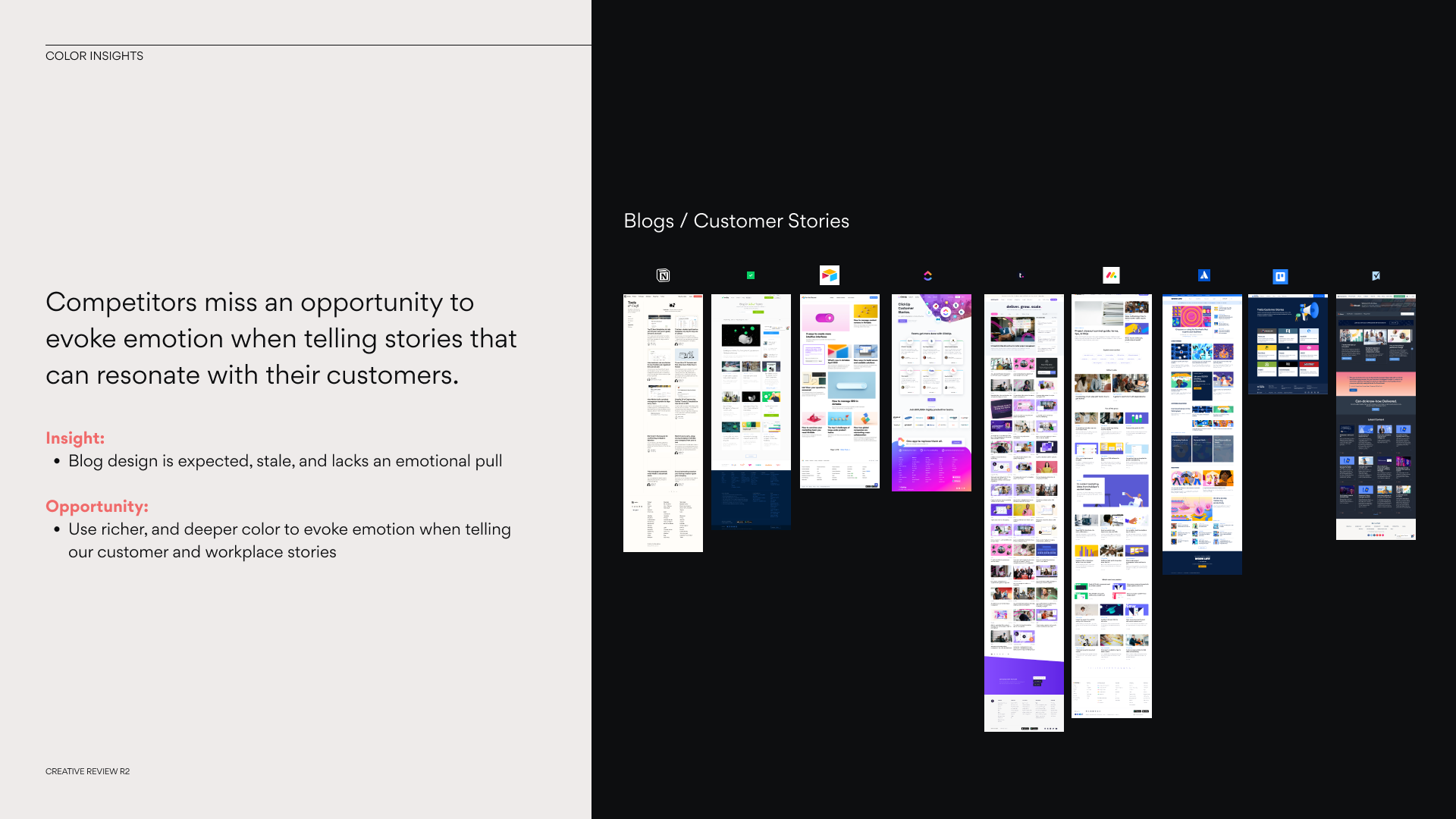
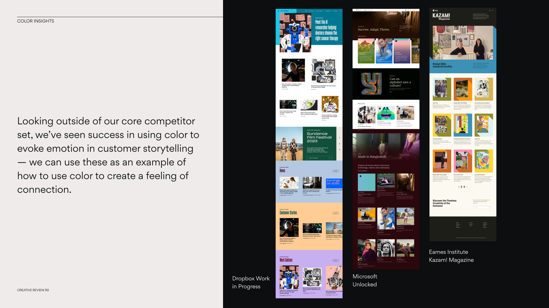
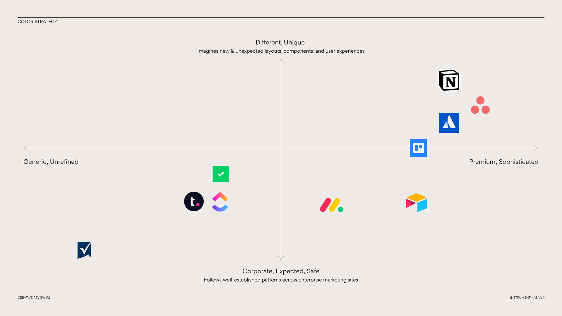
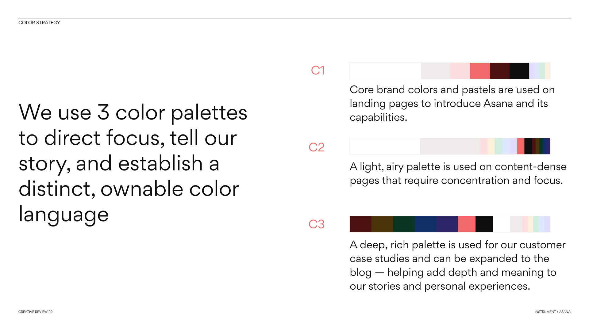
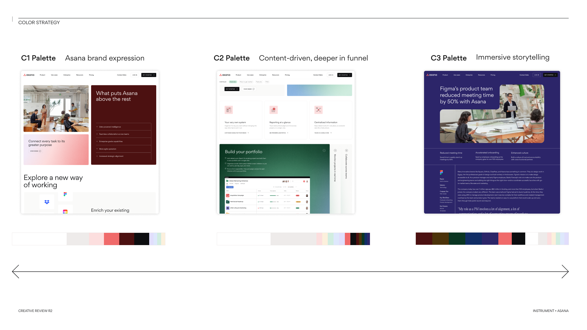
Using AI to Uncover and Define a Color Strategy
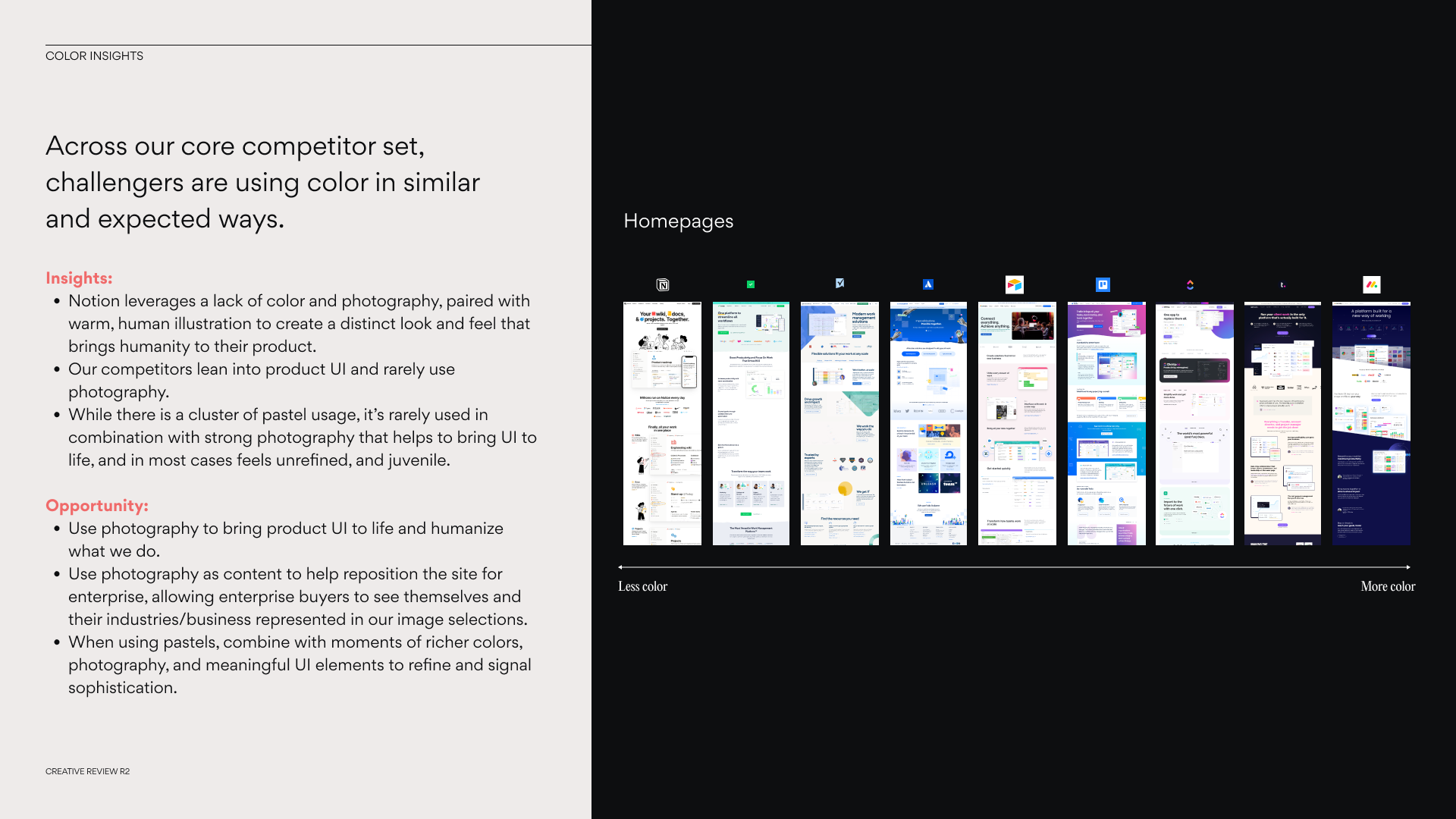
To ground our color strategy, we explored 3 core questions: How have other brands moving upmarket from SMB to enterprise used color? How is our core competitor set utilizing color within their web experiences? And finally, how can we strategically use color to make our site experience more distinct and ownable?
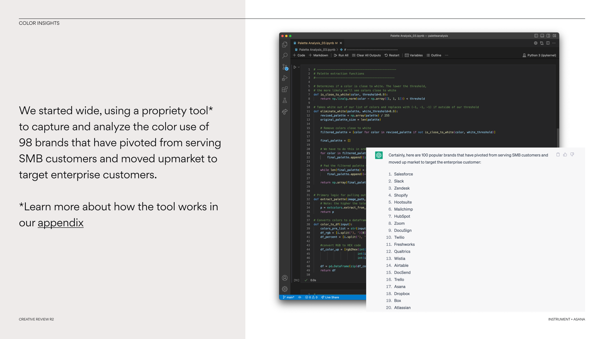
We started wide, using a propriety AI tool to capture and analyze the color use of 98 brands that have pivoted from serving SMB customers and moved upmarket to target enterprise customers. These insights coupled with a deep competitive audit helped us craft an approach to color that Asana could own, being distinct yet approachable with enterprise audiences.
A Modular and Immersive Component System
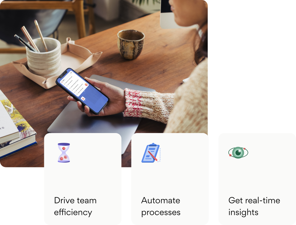
Our vision is a site experience that’s as dynamic and immersive as it is utilitarian and functional.
By taking a structured, modular approach that builds on our Asana narrative, we fuse exploration and discovery with moments of joy and delight to make a strong impression on enterprise customers, bring clarity to our product offerings, and helping them uncover the information they need, fast.
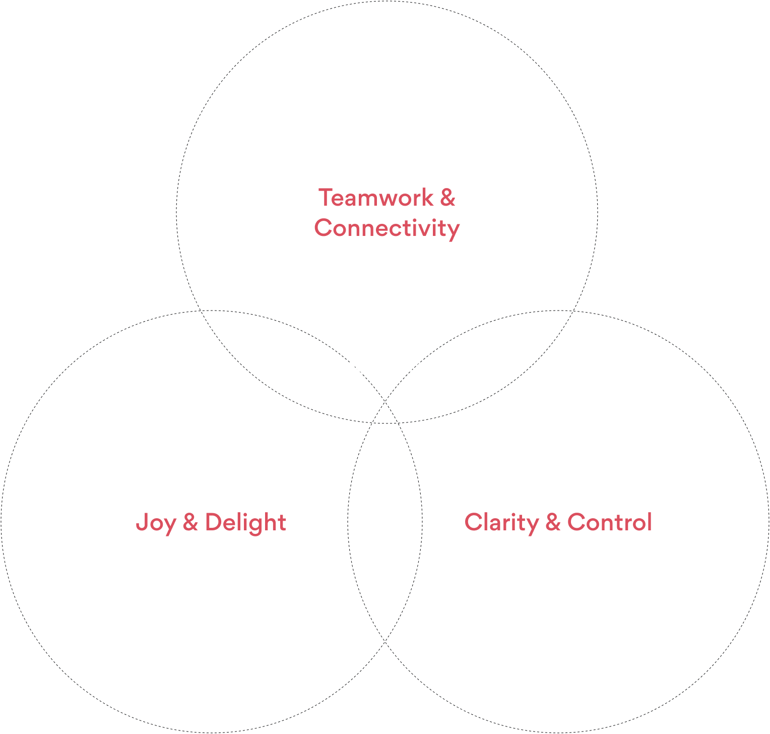
Rooted in Experience Principles
Our three experience principles serve as creative guardrails that help us achieve our conceptual vision.
From the use of color to content hierarchy, photography, wayfinding systems, and more, our experience principles help us thoughtfully and intentionally ensure that every design decision is working toward a greater purpose.
→ Lead with Simplicity
→ Encourage Exploration
→ Humanize the Product
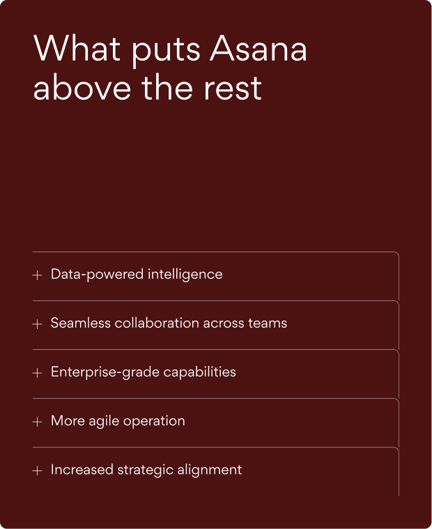
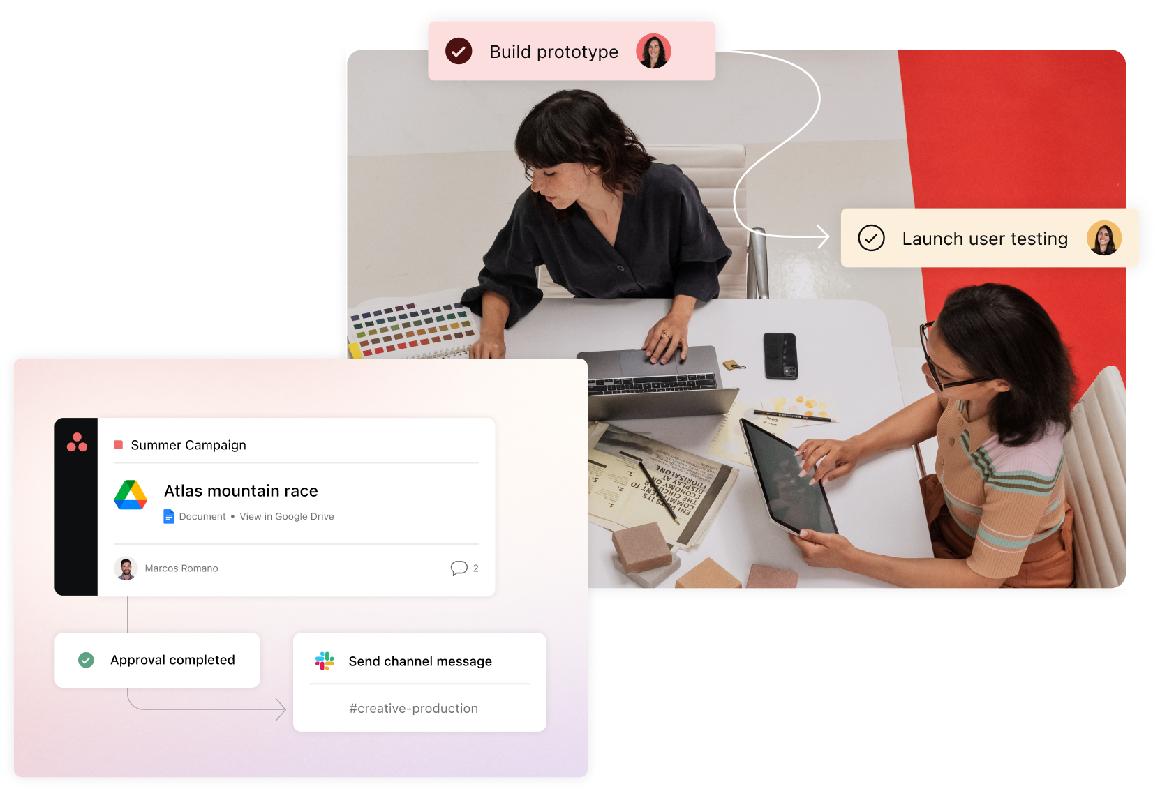
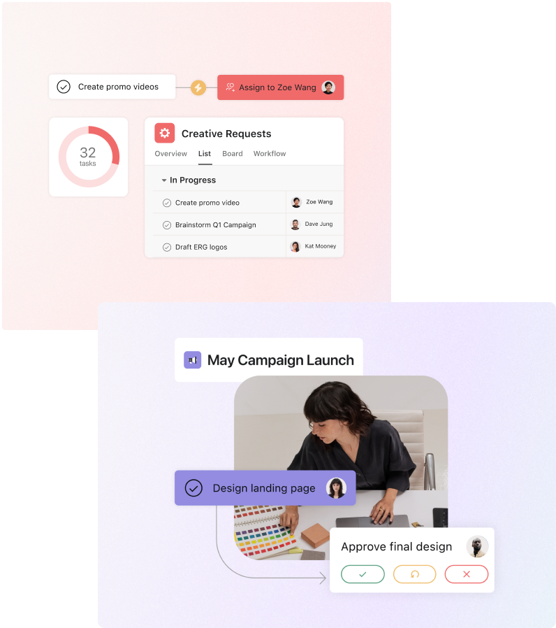
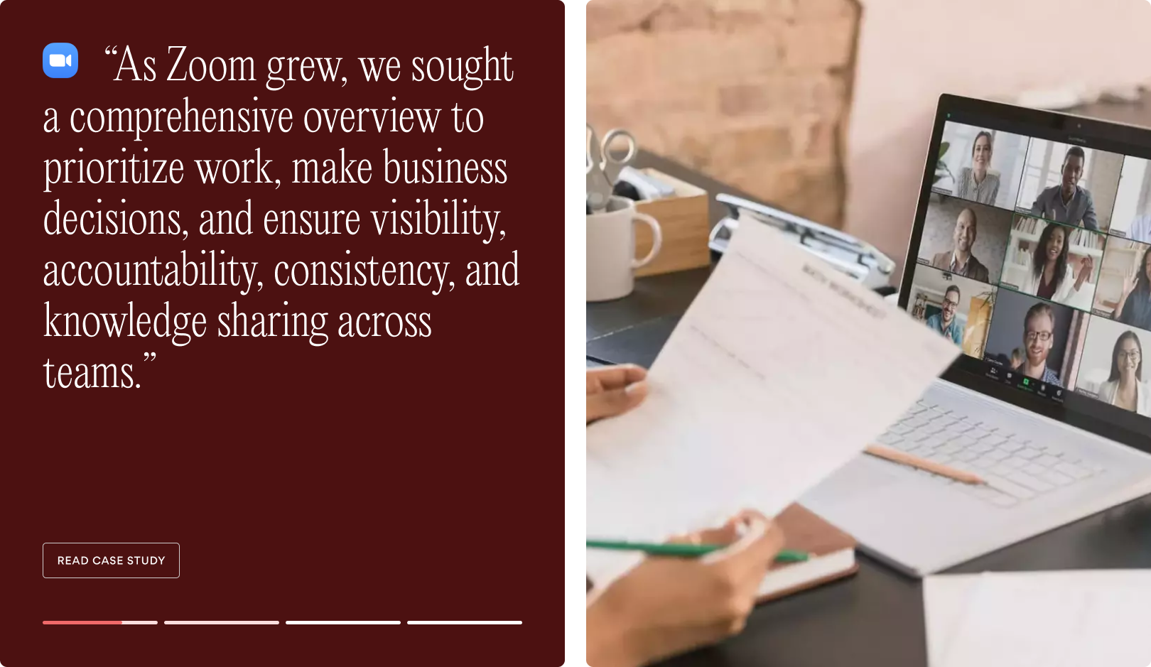
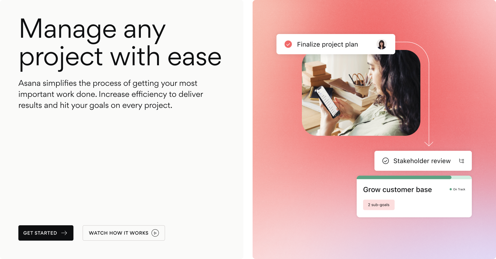
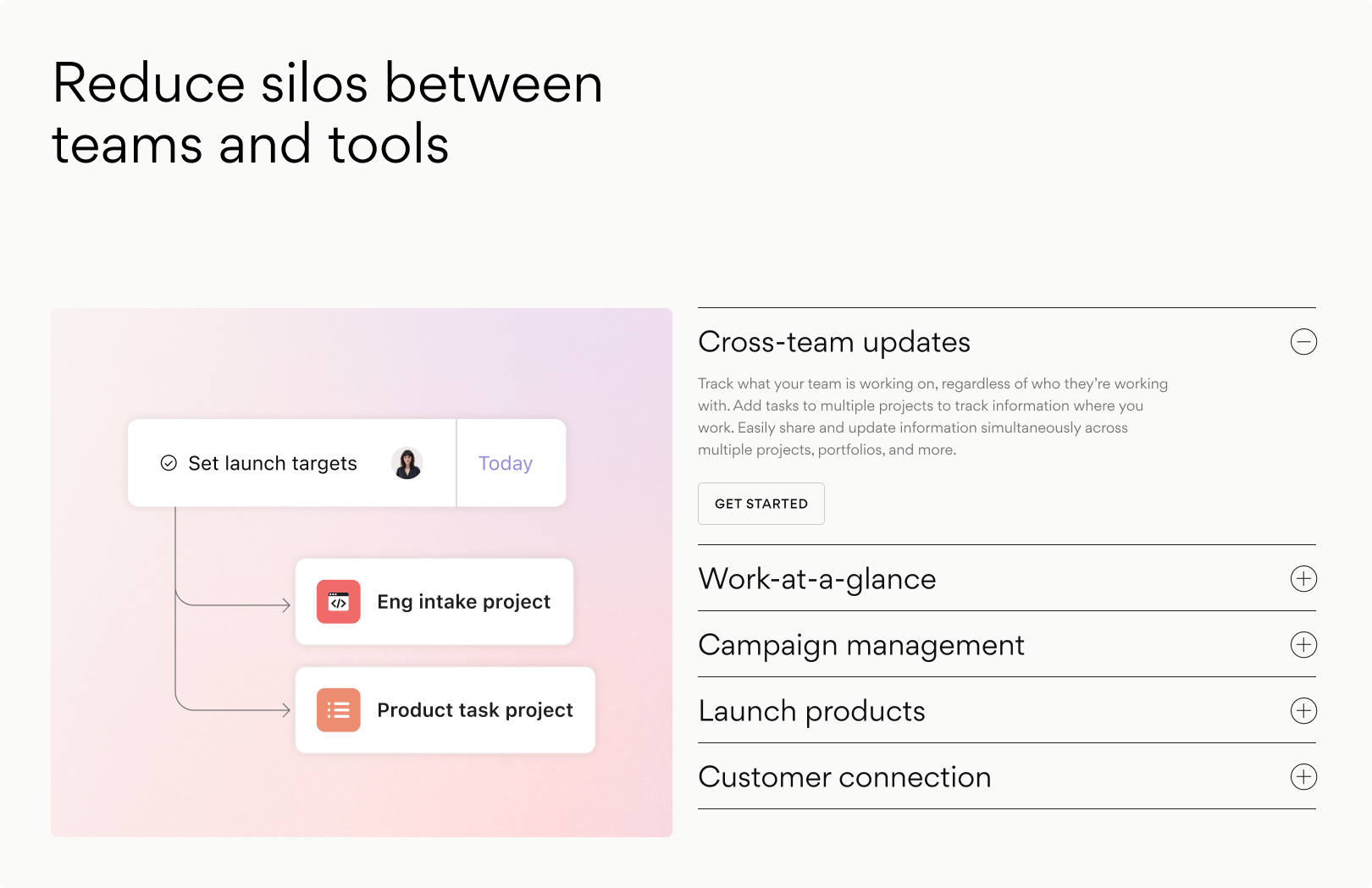
Content-Rich Modules
These text-heavy modules play a vital role in conveying the page's core storyline by presenting primary messaging, supporting points and highlighting key benefits.
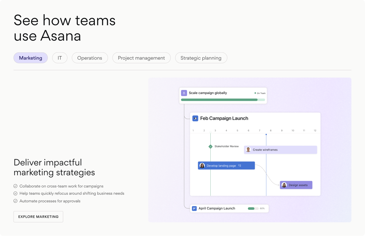
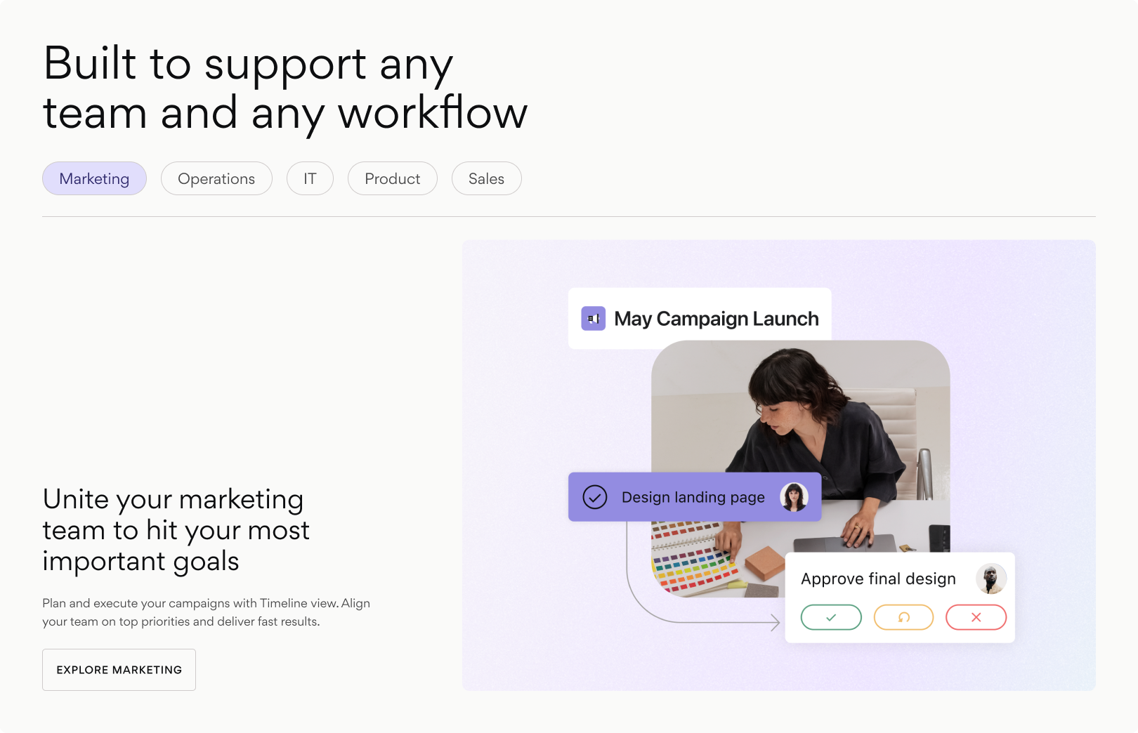
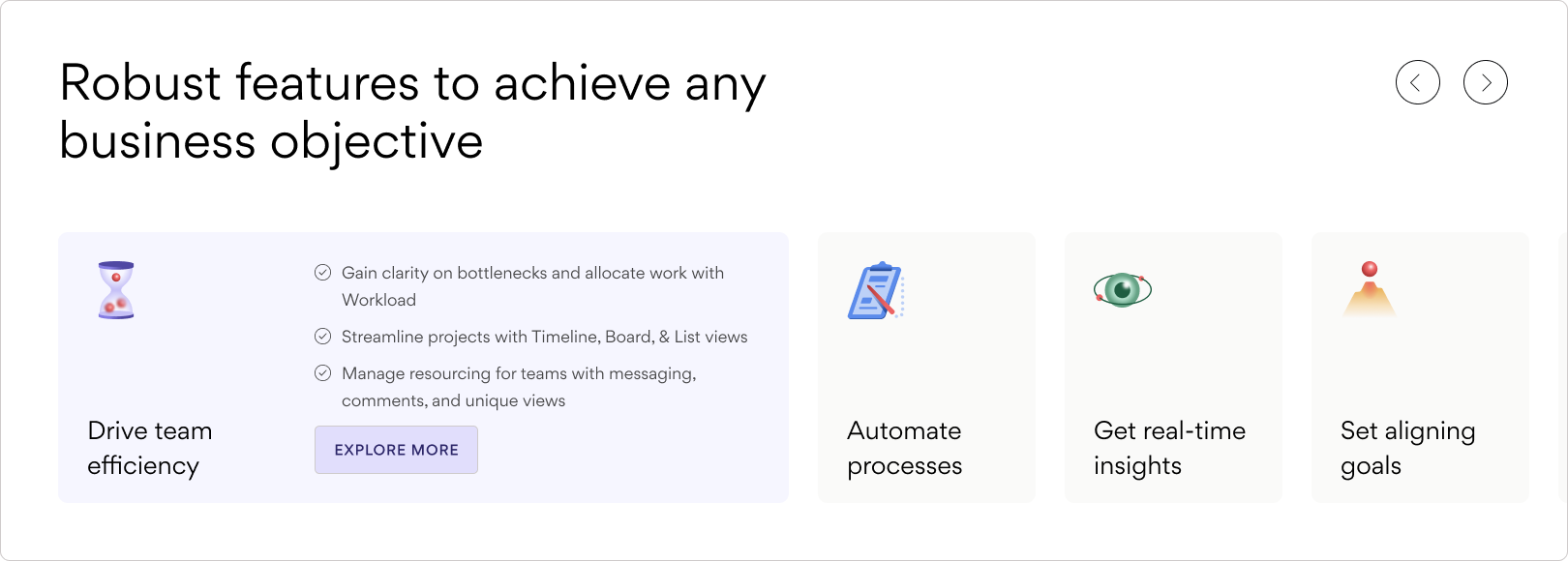
UI Modules
Used to show the product in action. Typically mid-to-low-fidelity UI when viewed on top-level pages of the site.
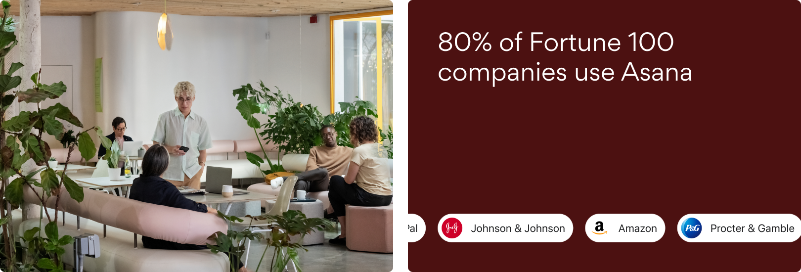
Storytelling Modules
Used to support the central story of the page and bring humanity to the site, as well as break up content-heavy modules by offering some breathing room.
Product UI as Storytelling
Our approach to UI allows for varying levels of fidelity, depending on the depth of our story and connection to the product experience.
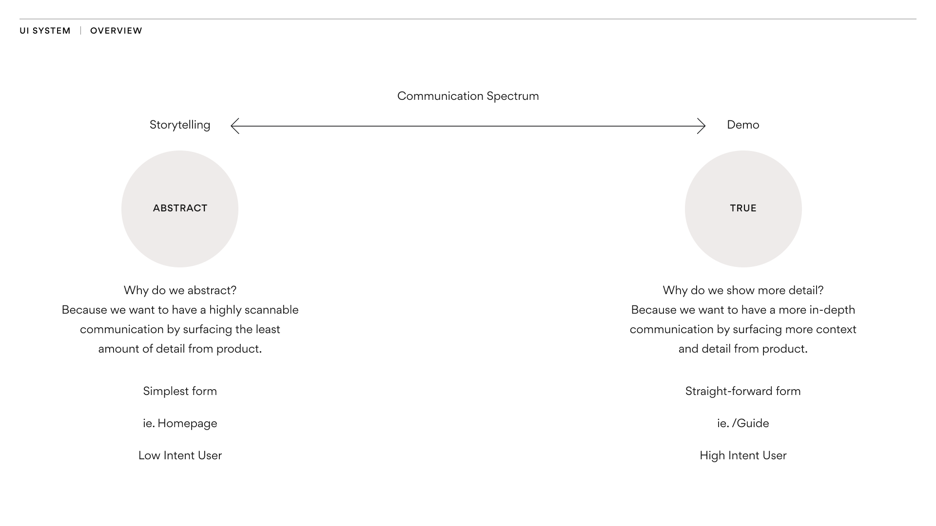
Low-Fi
Telling a single, focused story of collaboration and connectivity
• Low-intent user
• Simplest form of UI
• Used more in the overarching hero or overview pages (e.g. Homepage, Product Overview)
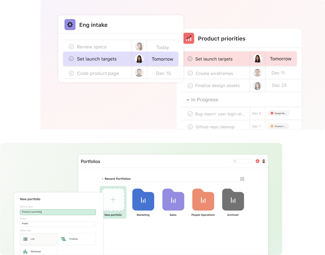
Mid-Fi
Visualizing product breadth and scalability through more complex user journeys
• High-intent user
• Straightforward form of UI
• Used in pages and sections that are more instructional, or for diving deeper into specific product functions (e.g. Product Overview, Portfolio)
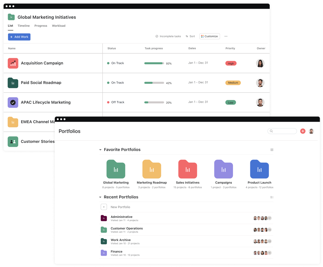
High-Fi
Giving users a close preview of the real product experience
• High-intent user
• Realistic form of UI
• Used in deeper pages within the website experience (e.g. Portfolio)
2024 © Rachel Gibbons